|
| Home | Articles | Winterthur Primer: Underglaze Blue English Transfer-Printed Earthenware |
 |
|
by Patricia Halfpenny
|
| It is widely accepted that Josiah Spode (1733-1797) of Staffordshire, England, perfected underglaze transfer-printing in blue for English earthenware production in about 1784.1 The color blue maintained its hue under the intense heat of firing and also reminded consumers of desirable wares imported from Asia.2 Other potters soon realized the economic advantage of mass-produced printed decoration over traditional hand coloring, and production grew.
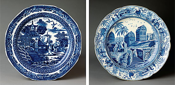
The first blue transfer-printed patterns produced in Staffordshire were Asian scenes and designs, many of which appear to be based on original Chinese patterns. The earliest English patterns are often coarsely engraved and printed in a dark, inky blue (Fig. 1).
|
 |
 |
LEFT TO RIGHT: Fig. 1: Plate, Staffordshire, England, circa 1790-1810. A Chinese-inspired design coarsely engraved and printed in an inky-blue. Courtesy of Winterthur Museum, 78.81.1.; Fig. 2: Plate, Josiah Spode (1733-1797), Staffordshire, England, circa 1815–1820. "Sarcophagi and Sepulchres at the head of the Harbour at Cacamo," a design from the Caramanian series copied from "Views in the Ottoman Empire...Taken by Luigi Mayer" in Views in Egypt, Palestine, and the Ottoman Empire, Vol. II, published 1803. Courtesy of Winterthur Museum, 1974.65. These views reflected the interest in the "antique" and the Grand Tour that gave rise to the neoclassical style. The design, printed in a clear bright blue, comprises engraved lines and stippling that gives a greater tonal range. Transfer printing in this color was popular in England and America and is typical of the 1815-1830 period.
|
| The landscapes have the traditional Chinese perspective, with the bottom of the scene representing the foreground, the middle distance in the centre, and the far distance at the top; often resulting in pagodas and trees seeming to float on clouds above the main design.
Many of the Chinese-inspired patterns include weeping trees. Perhaps it was for this reason that in the eighteenth and early nineteenth century blue transfer patterns were generally known as "willow" patterns. It was during the Victorian period that one "willow" was singled out, and in 1849 the romantic tale of tragic lovers was first written to rationalize certain features of the pattern. Since that time the story has become so well known that it is often mistaken for an authentic, traditional Chinese legend.3
|
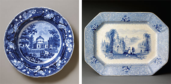
As the skills of the potter developed, bodies and glazes improved, and with the refinement of cobalt preparation for the blue, a clearer, brighter transfer print was produced. In the early nineteenth century it was usual for the pattern to cover the whole ceramic piece; the large central scene encircled by a wide border. The engravers also became more expert at their craft; line engravings were improved and stipple punching was introduced giving greater tonal range. The combination of cut lines and punched dots allowed a freer expression of light and shade, of depth and perspective. From the early years of the nineteenth century these more sophisticated techniques were employed to meet the change in taste and fashion. The prints now reflected the gentlemanly interest in botany and the natural sciences, and topographical views of Europe and Great Britain appeared, inspired by artists' impressions made while on the Grand Tour (Fig. 2). The American customers had their own preferences, and as well as the royal blue designs in the English taste, there was a large market for topographical scenes of England and North America printed in a very dark blue (Fig. 3).
|
 |
|
LEFT TO RIGHT: Fig. 3: Plate, Ralph Stevenson & Williams, Staffordshire, England, circa 1825."Philadelphia Water Works," a design derived from an engraving by Cornelius Tiebout. Courtesy of Winterthur Museum, 96.4.9. Transfer printing in a deep blue color was popular in America, but not in England. Transfer printing in this color is typical of the 1820-1830 period; Fig. 4: Platter, William Adams & Sons, Staffordshire, England, circa 1835–1840. Courtesy of Winterthur Museum, 1983.125. "Columbia" is a design typical of the 19th century imaginative Gothic style. The pale blue print with an expanse of white earthenware body is typical of the 1830-1850 period.
|
As transfer printing became established as a cornerstone of the English pottery industry, the manufacturers continued to respond to changing taste and fashion. By 1830, as an alternative to the all-over blue printed pattern, designs with a more open feel were introduced (Fig. 4). The centre print was now not inspired by actual scenes or botanical specimens but was based on imagination and fantasy. The views of Venice, the Alps, Egypt or China would never have been recognized by their inhabitants, nor was the flora and fauna necessarily realistic, however, overall compositions were pleasing and found a ready market. One of the most striking differences between the earlier patterns and the new styles is the paler blue color and overall lighter tone of the print. This was achieved by reducing the amount of stippled ground and having a smaller central design and border with much more of the white earthenware body showing.
|
| A new product emerged when these more open patterns were printed in deep blue. The result was an effect known as "flow blue," where the blue flowed in the glaze and blurred the details of the pattern, resulting in an ethereal looking image. American consumers showed a preference for this style, which was a lucrative product line for the Staffordshire potters from the 1840s into the 1860s.
After the 1860s new processes for full-color printing superseded the role of transfer printing. Blue was still used, becoming the vehicle for patterns based on various past traditional styles. The fascination with blue transfer-printed pottery continues. Many museums, including Winterthur, have collections of transfer-printed pottery, and for beginners or experienced collectors the Transferware Collectors Club (www.transcollectorsclub.org) offers a community that encourages interest in the subject.
|
|
Patricia Halfpenny is director of museum collections at Winterthur Museum, Winterthur, Delaware.
|
|
|
1. The process involved coating an engraved copper plate with colored oil; the surface of the plate was then cleaned leaving oil in the engraved lines. Special tissue paper was placed onto the copper plate and, with mechanical pressure, the oily design was transferred to the paper, which was in turn pressed onto the surface a biscuit-fired (unglazed) ceramic object. The paper was scoured and the oily design transferred to the ceramic. The paper was washed off and the object was heated (a hardening-on fire) to dry out the oil before glazing and firing.
2. Other colors such as brown, green, purple, yellow, and red were introduced in the early nineteenth century. While a transfer image could be applied over the glaze, the image was easily scratched off; thus transfers applied under the glaze were more desirable.
3. The first known published account of "The Story of the Common Willow-Pattern Plate," was from an edition of the Family Friend, vol. 1 (London, 1849). There are many variations of the poem, which include elements of the typical Willow pattern plates: two young lovers escaping over a bridge, sailing away in a junk to an oasis until caught by the girl’s father, put in a tower and later executed for their forbidden love, then turning into doves symbolizing their true love.
|
|
 Download the Complete Article in PDF Format Download the Complete Article in PDF Format  Get Adobe Acrobat Reader Get Adobe Acrobat Reader
|
|
 |
|
|
|